
Click image to enlarge
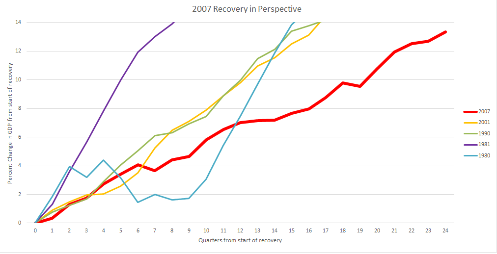
Entering into the 3rd quarter of 2015, the US is now 6 years removed from the trough of the 2007-09 recession. The chart above shows the progress of the subsequent recovery over those 6 years, and compares it relative to past recoveries dating back until 1980. The most recent GDP report showed the current economic recovery continues to move in the right direction. The 2nd quarter annual rate of growth came in at 2.3%, and a previous 1st quarter contraction of 0.2% was revised to a 0.6% expansion. However, this puts the first half of 2015 at a pace slower than the already meager 2% average annual rate of growth we have been experiencing since 2012. This sluggish growth has led to the weakest economic recovery in postwar history.
SOURCE


Thanks! What I am asking about the chart is how could we “start” another recession in 1981 if we were coming out of a recession that started in 1980 – just one year before?
Don Huntington don.m.huntington@gmail.com huntingtond@william.jewell.edu 913-522-8110