
Chart of the Week: Predicting Rate Changes
Click picture to enlarge
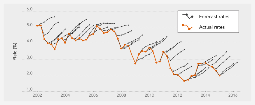
This week’s chart shows just how difficult it is to predict rate changes. The black lines represent five quarters of median forecasts of the yield on the 10-year U.S. Treasury. The orange line represents the actual realized yield during that particular point in time. These forecasted predictions come from the Survey of Professional Forecasters (SPF), as measured by the Federal Reserve Bank of Philadelphia. It is easy to see that forecasters have been too bearish on bonds for the past 10+ years, consistently overestimating future increases in rates.
SOURCE

