
Chart of the Week: Chasing the S&P 500
Source
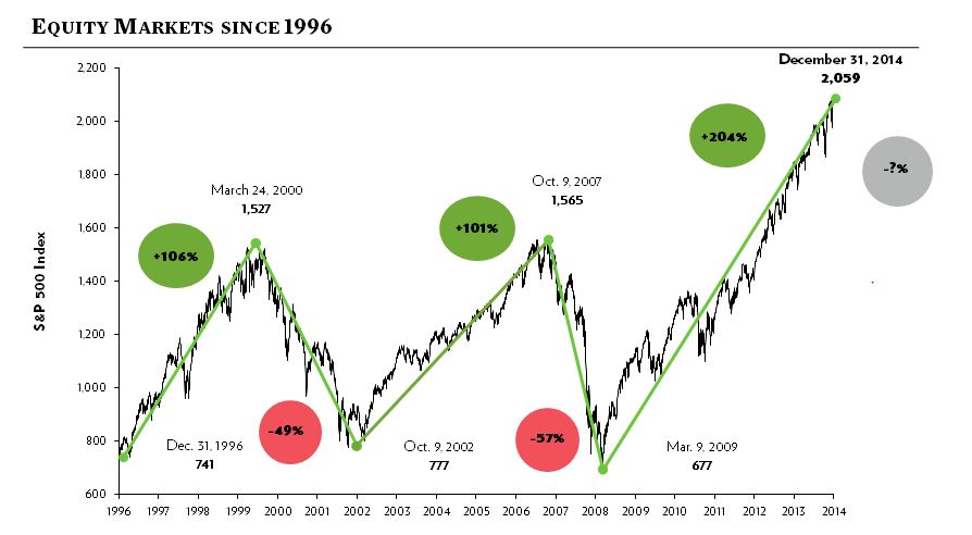
This week’s chart is a visualization of the risk that comes with investing in the S&P 500. Due to its rapid increase since the bottom of the 2008 recession, the popular use of the S&P 500 as a benchmark to track portfolio performance has led to misguided investor expectations of returns for a properly diversified portfolio. With the S&P 500 hitting all-time highs, it has never been more important nor more challenging for investors to understand the significance of downside protection and staying within their own level of risk. Forbes, Market Watch, Investment News, and many others have come out with articles that may be beneficial to share with clients to help them make sense of the current market conditions in relation to a diversified portfolio.

