
Chart of the Week: Pre-Election Year Historically Positive
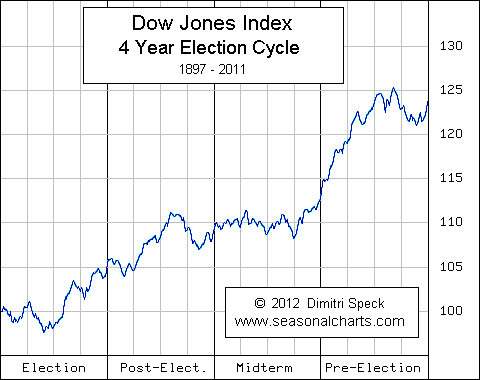
The chart shows the average trend of the DIJA for each period of the 4 year election cycle from 1897-2011. By far the best year, on average, has been the “pre-election” year, which is, of course, the year we are entering into now. During this period, administrations typically have a habit of going to greater measures to stimulate the economy so that voters go to the polls with positive feelings towards the state of the economy. This has historically boded well for the stock market. In fact, since the end of World War II, 94% of the pre-election years were positive.

